About the process of creating and exploring a visual site proposal implemented with WordPress full site editing
Arquitectónicamente (ARQ%) is the first iteration of an architecture event organized by Catálogo Arquitectura. When we began this project, only a logo and brand/event objectives existed. The premise was to explore and develop the visual identity for the website, implementing it with WordPress Full Site Editing capabilities within a 4-week timeframe.
We found the project compelling as it allowed us to deepen our expertise in visual identity design and leverage the latest WordPress features for site development. Given the tight deadline, we prioritized fluid and transparent communication throughout each iteration to align deliverables with the client’s vision.
Our client had prior knowledge of user interface (UI) design, which enriched collaboration during iterative stages.
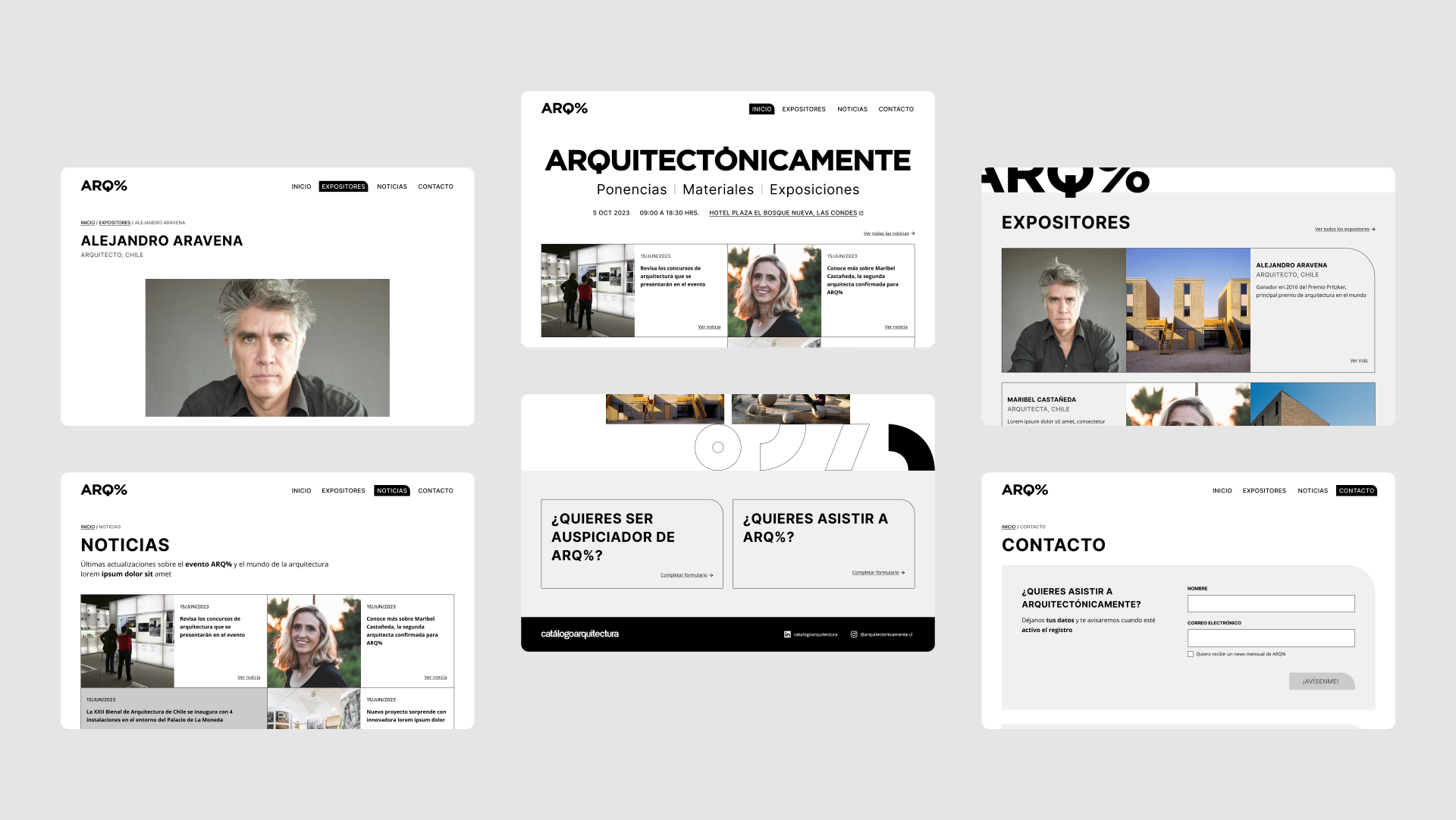
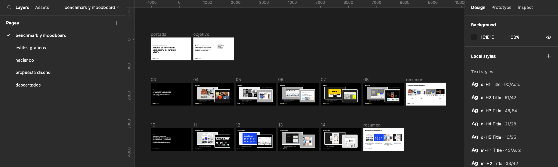
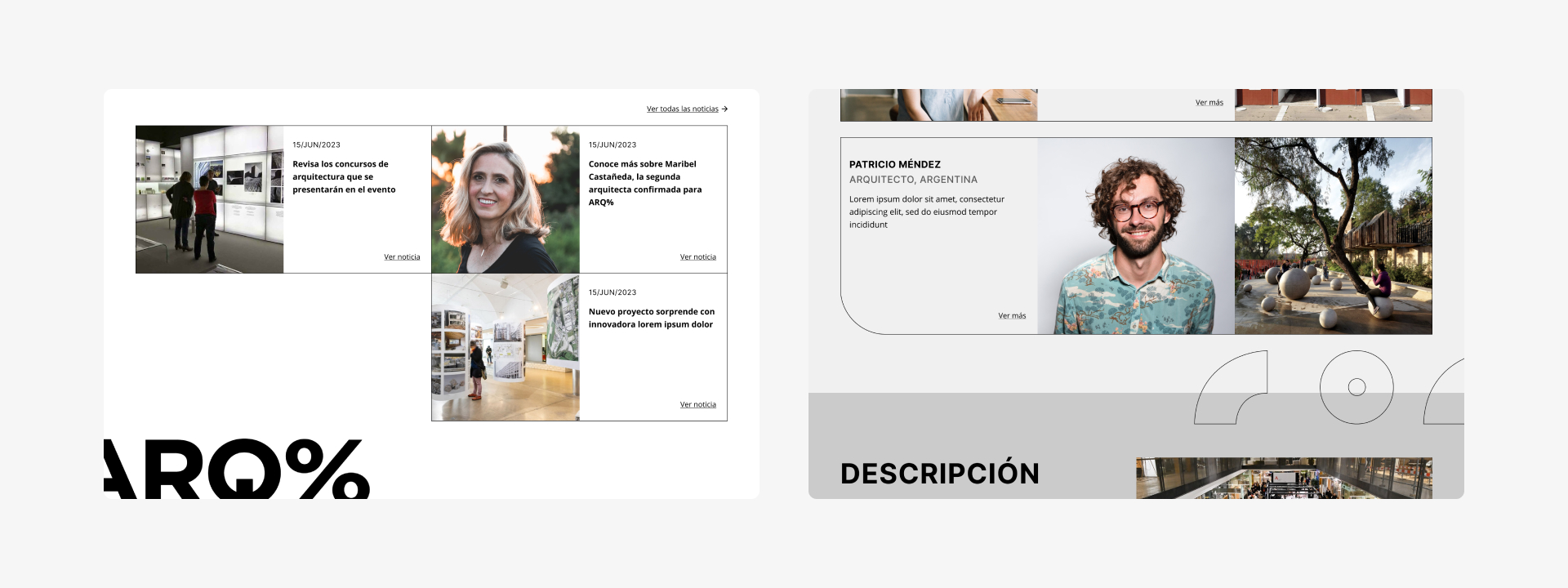
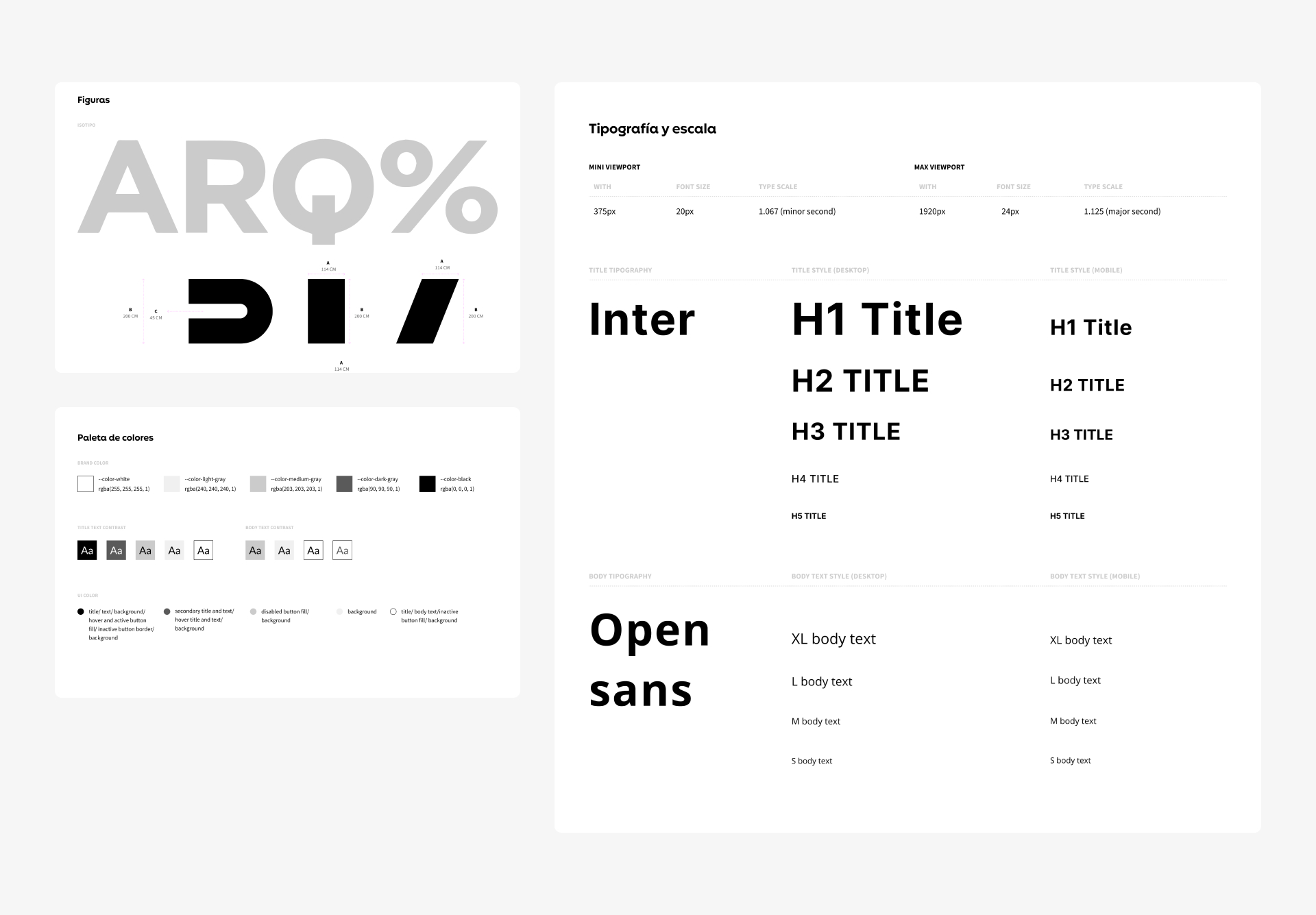
We began by gathering references, categorizing them into critical site-defining elements: typography, color palette, graphic assets, featured sections, speaker displays, and data presentation—all contributing to the event’s communicative intent.
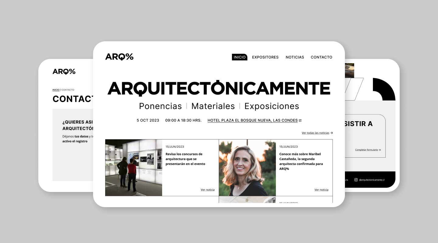
This strategic approach helped identify key design blocks to maximize visual impact with minimal CSS intervention. Speaker and news blocks became the most representative of the proposed visual identity, streamlining other graphic decisions (e.g., contact links, decorative figures).
The visual proposal drew from benchmark/moodboard agreements, with parallel frontend iterations to prototype progress—even before final design approval.
A pivotal UI/frontend collaboration was typography selection and scaling, ensuring faithful implementation across screen resolutions.
The final design embraced architectural aesthetics: straight lines, geometric shapes (filled + linear), minimalist color use, and negative space. Subtle touches softened rigid elements for visual harmony.