Graphic update of the Pictos app and new support for online task aids. General user interface redesign and usability improvements to support new content taxonomies.
Challenge
Develop a new design proposal incorporating new functionalities, visual enhancements, user experience (UX) and navigation improvements.
PICTOS is a free, open-source application designed to provide visual supports that make services more inclusive and accessible.
Currently available in Chile, its tools are being used across the Health, Transportation, Procedures, and Leisure sectors. As part of expanding support to online platforms, an opportunity arose to enhance visual design, user experience, and navigation.
UX/UI Analysis
To begin the graphic redesign process of the app, we conducted an analysis of the current interface state, identifying the following improvement areas:
Target Accessibility: Elements like “services” and “places” lists lacked clear visual boundaries for clickable areas, making it difficult to identify them as interactive components.
Visual Language Consistency: We observed inconsistencies across components, illustrations, and pictograms, particularly in the use of borders, filled shapes, shadows, and rounded edges, which lacked a unified design strategy.
Opportunity: We identified potential for improvement by developing a graphic proposal that preserves the essence of pictograms, aiming to build a cohesive visual identity across all touchpoints.
Color Palette: While the project included a color palette with blues and yellows, the app only used one color and its variations, creating a monotonous rhythm across different views.
Focus on Actionable Elements: We recognized opportunities to enhance element grouping to more prominently highlight screen areas critical for user actions.
Overview of interfaces with previous graphic version
Graphic Update Development
Moodboard
In this phase, we focused on gathering references to build a visual ecosystem grounded in graphic elements that simplify the understanding of actions within the application.
“Benchmark & Moodboard” presentation overview
Graphic Definitions
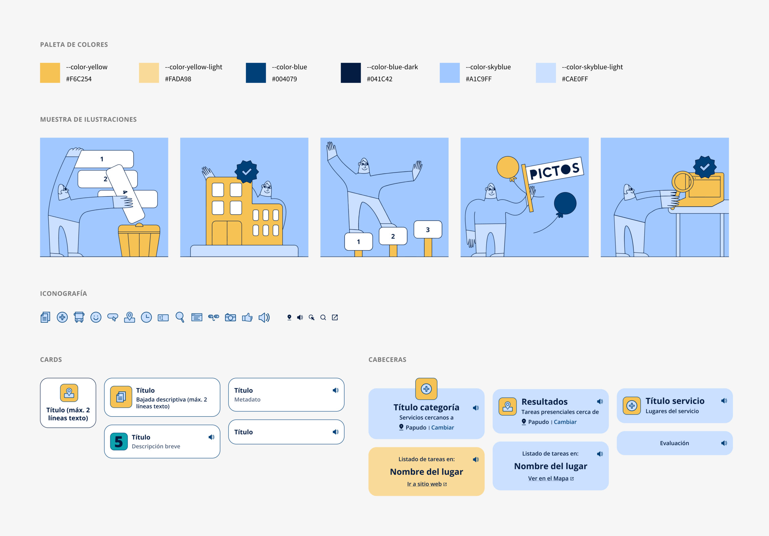
Color: the color palette was expanded to include all primary tones, along with lighter variants for each.
Illustration: inspired by the simplicity and linear strokes of pictograms, we designed a character that interacts with abstract representations of objects from each instruction.
Both elements—the character and the objects—are differentiated through a contrasting color palette, creating a sense of familiarity and visual cohesion through repetition.
Additionally, we prioritized a neutral and universal visual language to ensure adaptability and scalability for internationalization.
Typography Scale: the typographic scale was redesigned with new sizes to establish a clear visual hierarchy between content and components (e.g., section titles vs. card titles, metadata, secondary text).
Components: recognizing the importance of grouping information for efficient content digestion in an interface, we introduced two key components:
Cards – Designed to support metadata, icons, and links within a unified context.
Headers – Used to structure and highlight key sections.
Iconography: we implemented Material Symbols to enhance specific app actions (e.g., external links, sound activation) and as supporting elements for category cards and evaluation instructions.
Excerpt from the design system
Structural Improvements
Information Architecture Redesign
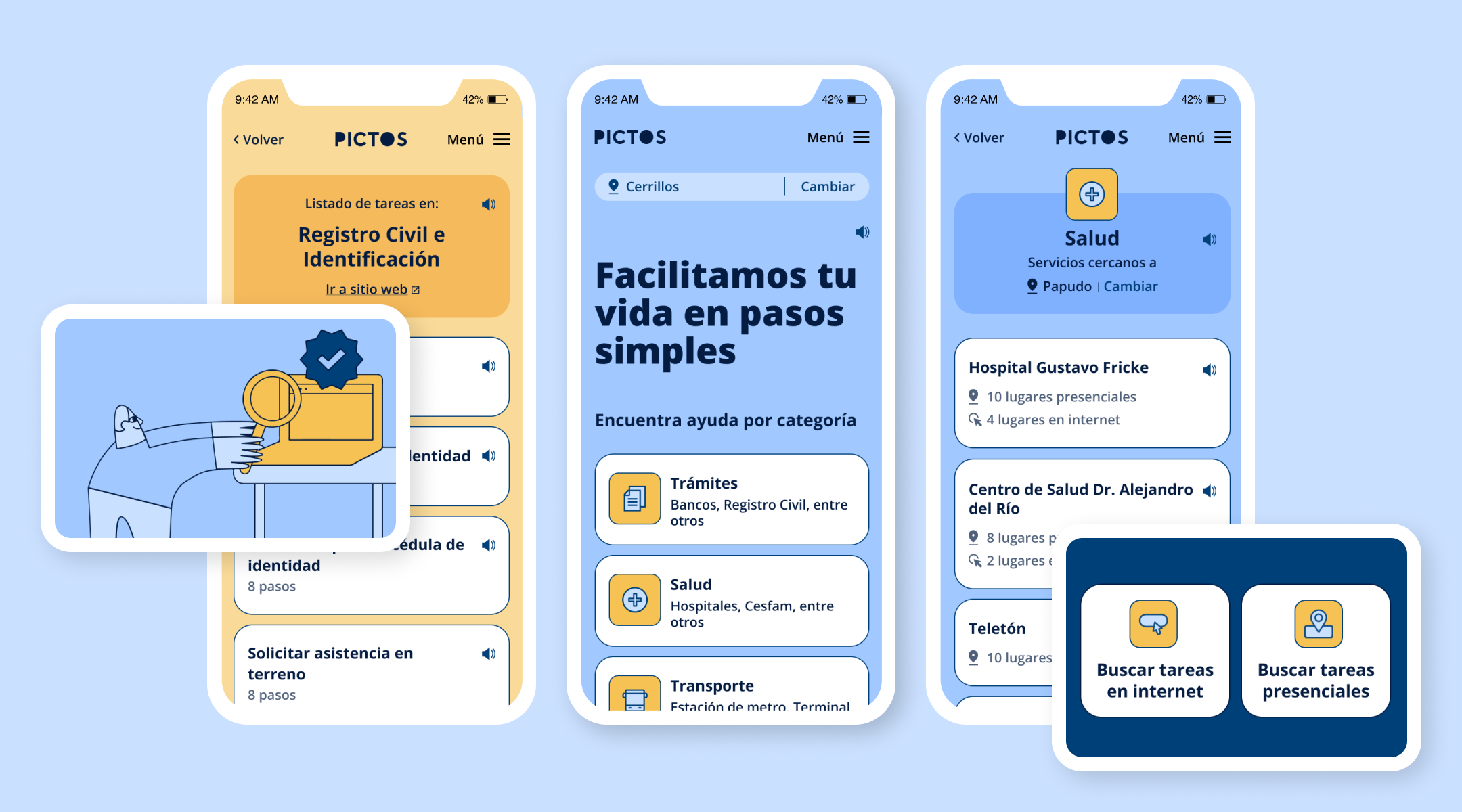
To accommodate new functionalities, we restructured the information architecture to seamlessly integrate digital services (“online locations”) alongside existing in-person services. A color-coding system was implemented for clear distinction:
Yellow: Actions related to digital services
Light Blue: Actions linked to in-person services
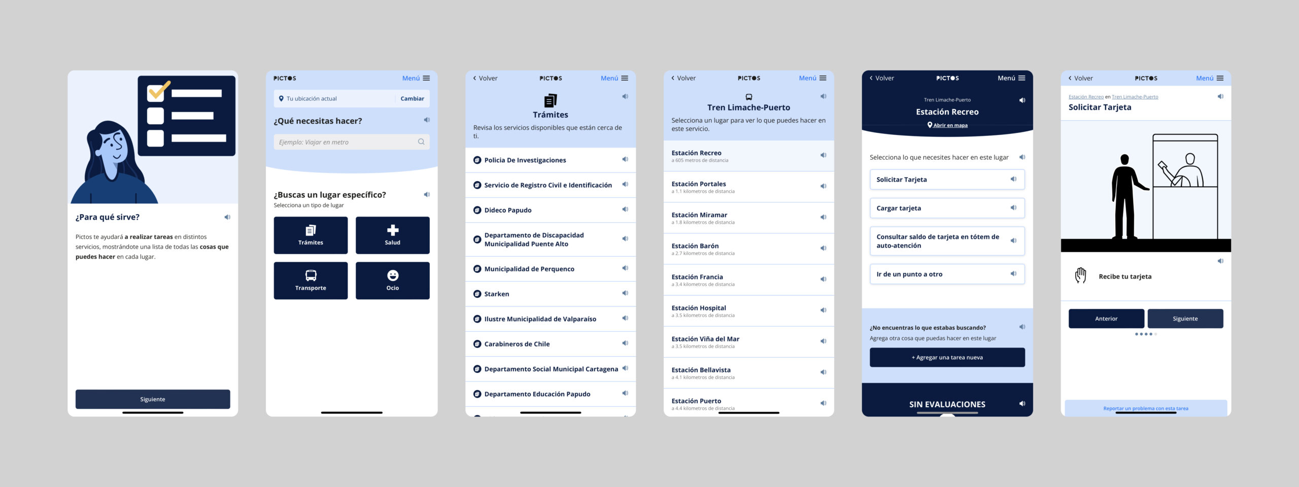
Navigation
Overhauled the home screen’s main access points, adding a search tool with preset filters for both service types.
Within each “Service”, sections now feature hierarchical headings to enhance user orientation.
Labeling & Plain Language
A strategic content audit prioritized:
Clarity:
Added a descriptive primary headline communicating the app’s core purpose.
Replaced vague prompts like “Search for a specific location” with “Find assistance by category”.
Semantic Consistency:
Reserved the term “locations” exclusively for lists within a “Service”, always paired with its context (“online” or “in-person”).
Components & Visual Hierarchy
Cards: Now include contextual metadata (e.g., content type, resource count) to set user expectations.
Headers: Establish a vertical visual narrative, reinforcing key flows: Services, Service locations, Location task lists, Search results, Evaluation
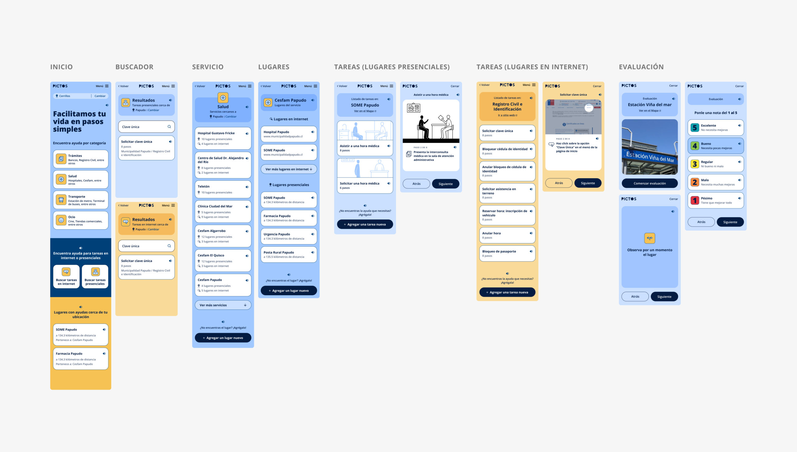
UI overview showcasing applied updates
Project Background
This post details the original implementation and previous updates prior to this redesign.